Colorado State University
Module 5: Figures in R
By generating figures and graphs, you can provide visual context to data in a manner that is typically easier to understand than looking at tables. In addition to helping understand data structures and trends, data visualization can help identify outliers and check overall data quality.
1. Plots in R
data(mtcars)
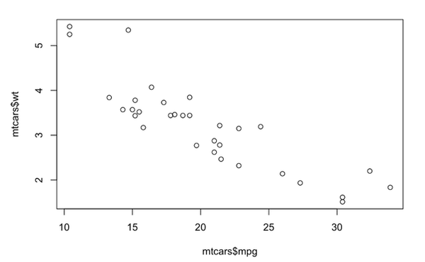
plot(mtcars$mpg, mtcars$wt)

Notice that we didn’t need to load any packages for that to work. The mtcars dataset is built into R, as is the plot() function. This is base R plotting.
For making figures in R, the ggplot2 package is much more popular because it is essentially endlessly flexible, as well as more asthetically pleasing.
2. Visualizing Data with ggplot()
The ggplot2 package provides a variety of functions that allow you to generate nearly any quantitative plot you would find in a scientific journal. A comprehensive list of all ggplot2 functions is available here: https://ggplot2.tidyverse.org/reference/.
Similar to how data manipulation steps are concatenated using the %>% operator, the elements of ggplot() are concatenated using a + sign. Dissimilar to data manipulation, the order in which ggplot() elements are appended does not (usually) matter after the first line. Although the ordering does not (usually) matter, a general code style of data/aesthetics > layers (geoms) > facets > scales > plot labels > theme. Now we are going back to the titanic dataset we have cleaned in the data analysis module.
2.1Basic Plotting
First, create a basic bar chart of which passengers survived and which did not. For the purpose of these plots, a numerical/binary variable for survival is less understandable to a layman than a character variable that spells out whether passengers lived or died. A general rule of thumb for graphs and figures is that they should be interpretable by a viewer who has little to no understanding of the data. In other words, figures should be entirely self-sufficient.
titanic_clean <- titanic_clean %>%
mutate(survived_char = ifelse(survived == 1, "Survived", "Perished"),
survived_char = factor(survived_char,
levels = c("Survived", "Perished")
)
)
ggplot(data = titanic_clean,
mapping = aes(x = survived_char,
fill = sex)) +
geom_bar(width = 0.5) +
labs(x = NULL,
y = "Count",
title = "Survival Counts of Titanic Passengers by Sex",
fill = NULL)

2.2 Intermediate Plotting
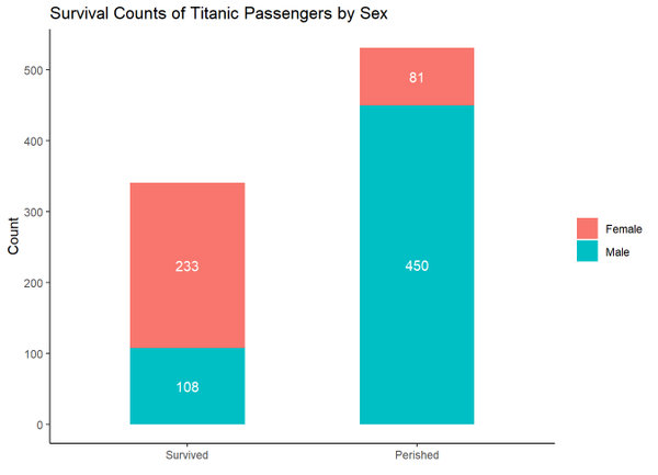
These next several plots are merely meant to highlight a few capabilities of ggplot(). In the following example, geom_text() is used to impose the passenger counts associated with each colored bar, scale_y_continuous() is used to specify where the ticks occur along the y-axis, and theme_classic() is a built-in theme that removes some of the plot borders and grid lines.
ggplot(titanic_clean,
aes(x = survived_char, fill = sex)) +
geom_bar(width = 0.5) +
# add text to the plot that shows the size of each bar
geom_text(aes(label = after_stat(count)),
stat = "count",
color = "white",
position = position_stack(vjust = 0.5)) +
labs(x = NULL,
y = "Count",
title = "Survival Counts of Titanic Passengers by Sex",
fill = NULL) +
# specify axis breaks
scale_y_continuous(breaks = seq(0,500,100)) +
# use classic theme
theme_classic()

In this next graph, facet_wrap() is used to split the graph into three panels based on the income_class variable, theme_bw() is another built-in theme, and theme() further modifies aspects of the graph. Within theme(), element_blank() removes things, element_text() modifies text, element_rect() modifies borders and backgrounds, and element_line() modifies lines.
ggplot(titanic_clean,
aes(x = survived_char, fill = sex)) +
geom_bar(width = 0.5) +
labs(x = NULL,
y = "Count",
title = "Survival Counts of Titanic Passengers by Sex and Socioeconomic Status",
fill = NULL) +
scale_y_continuous(breaks = seq(0,400,50)) +
# split graph by socioeconomic status
facet_wrap(~income_class) +
# use the black and white theme
theme_bw() +
# eliminate most grid lines
theme(panel.grid.minor = element_blank(),
panel.grid.major.x = element_blank())

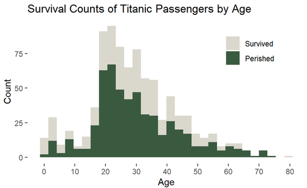
You can manually specify colors within scale_fill_manual() or scale_color_manual() either by name (e.g., “red”) or by hexadecimal code (e.g., “#FF1234”). Check out https://coolors.co/ for some great user-generated palettes (with hex codes!). The viridis package also provides great pre-made color palettes.
ggplot(titanic_clean,
aes(x = age, fill = survived_char)) +
geom_histogram() +
scale_fill_manual(values = c("#dad7cd", "#3a5a40")) +
scale_x_continuous(breaks = seq(0,90,10)) +
labs(y = "Count",
x = "Age",
title = "Survival Counts of Titanic Passengers by Age",
fill = NULL) +
theme_bw() +
theme(panel.border = element_blank(),
panel.grid = element_blank(),
# adjust the legend position
legend.position = c(0.8,0.8))

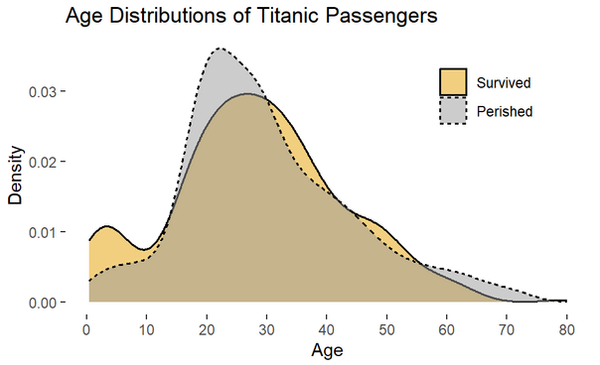
A density plot visualizes the distribution of a variabl (basically a smoothed histogram). Be wary, the area under any density plot equals 1, so these types of plots communicate nothing about sample sizes.
ggplot(titanic_clean,
aes(x = age, fill = survived_char, linetype = survived_char)) +
geom_density(alpha = 0.5, linewidth = 0.6)+
scale_fill_manual(values = c("#E69F00", "#999999")) +
scale_x_continuous(breaks = seq(0,90,10)) +
labs(y = "Count",
x = "Age",
title = "Survival Counts of Titanic Passengers by Age",
fill = NULL) +
theme_bw() +
theme(panel.border = element_blank(),
panel.grid = element_blank(),
# adjust the legend position
legend.position = c(0.8,0.8))

For actual research, all or none of these examples may be appropriate or suitable. The "best" way to visualize data is highly dependent on the type of data and the audience you are communicating with. These two sources can be very helpful:
-
Data to Viz – Helps you find appropriate graphs for your data
-
The R Graph Gallery – Provides R code for every graph imaginable
3. Saving Plots
Plots in R can be saved as objects, which can then be exported as images. With the ggsave() function, you can specify the image's height, width, and resolution (dpi).
p <- ggplot(titanic_clean,
aes(x = age, fill = survived_char, linetype = survived_char)) +
geom_density(alpha = 0.5, linewidth = 0.6)+
scale_fill_manual(values = c("#E69F00", "#999999")) +
scale_x_continuous(breaks = seq(0,90,10)) +
labs(y = "Count",
x = "Age",
title = "Survival Counts of Titanic Passengers by Age",
fill = NULL) +
theme_bw() +
theme(panel.border = element_blank(),
panel.grid = element_blank(),
# adjust the legend position
legend.position = c(0.8,0.8))
ggsave(plot = p,
filename = "C:/Users/joeyb/Pictures/titanic_density.png",
height = 6,
width = 9,
dpi = 300)